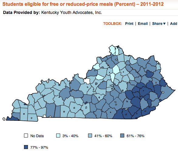
The map above comes from the newly-released 2012 KidsCount reporting on individual school districts, counties, and congressional districts. In it, you can see a fresh illustration of how many students across the state are growing up in homes with low incomes.
You can also see an illustration of how those difficulties cluster across the state. The eastern counties grab the eye, and don't miss Fulton at the opposite end of the state. Since they're harder to see, I'll also note that there are a set of independent districts also in the dark, difficult blue:
- Covington, Dayton, Newport, and Silver Grove in the north.
- Middlesboro and Jenkins in the east.
- Caverna in the central west.
- Fulton Independent, Mayfield, and Paducah in the far west.
I love the way the Kids Count maps include the range, letting you know that the state ranges from 3% to 97% participation in the free and reduced-price meal program. To illustrate where that range occurs, I'll include tables below listing the highest 10 and lowest 10 participation rates. I do hope you'll play with the KidsCount information for yourself, and I'm working on several more posts on what I'm seeing as I explore.


This school lunch data isn't correct. Better start asking questions about the Community Eligibility Option for lunch in some Kentucky schools and districts. That inflates the numbers.
ReplyDeleteAnonymous, if you have alternative information, please share it. Otherwise, it's hard to impossible for any reader to assess your claim.
ReplyDelete